
GRAPHIC DESIGN
I designed and created the works below as part of the graphic design curriculum at the University of Michigan.
Valentine's Day Poster inspired by Luba Lukova
Luba Lukova is an American artist and visual designer who frequently used bold contrasts and visual metaphors so that people can grasp their meaning in seconds. She frequently uses large black silhouettes.
I borrowed from her visual library to combine a quote about love and large black silhouettes to instantly tell the story of this quote.
Style Guide for the Ann Arbor International House
The Ann Arbor International House welcomes students and scholars from around the world, joining together as an international, intercultural, interspiritual living and learning community.
There are many international houses, but this one is unique to Ann Arbor. The logo and logotype combine the elements of the globe and the letter “A”, representing Ann Arbor. The circle in the middle of the “A” gives the impression of a door knob, and the “A” becomes a door. Together with the globe, this logo is a door to the world while also welcoming the viewer home.
Creating a Visual Series for University of Michigan Course Banners
In order to create a visual series, I took inspiration from the common theme of “Nature” in the courses. Using this theme, I decided on creating a chromatic identity based on blues and greens that all looked beautiful together. Taking this as inspiration, I used nature images with those blues and greens that shared long camera shot, thus unifying the images in color, zoom and theme.
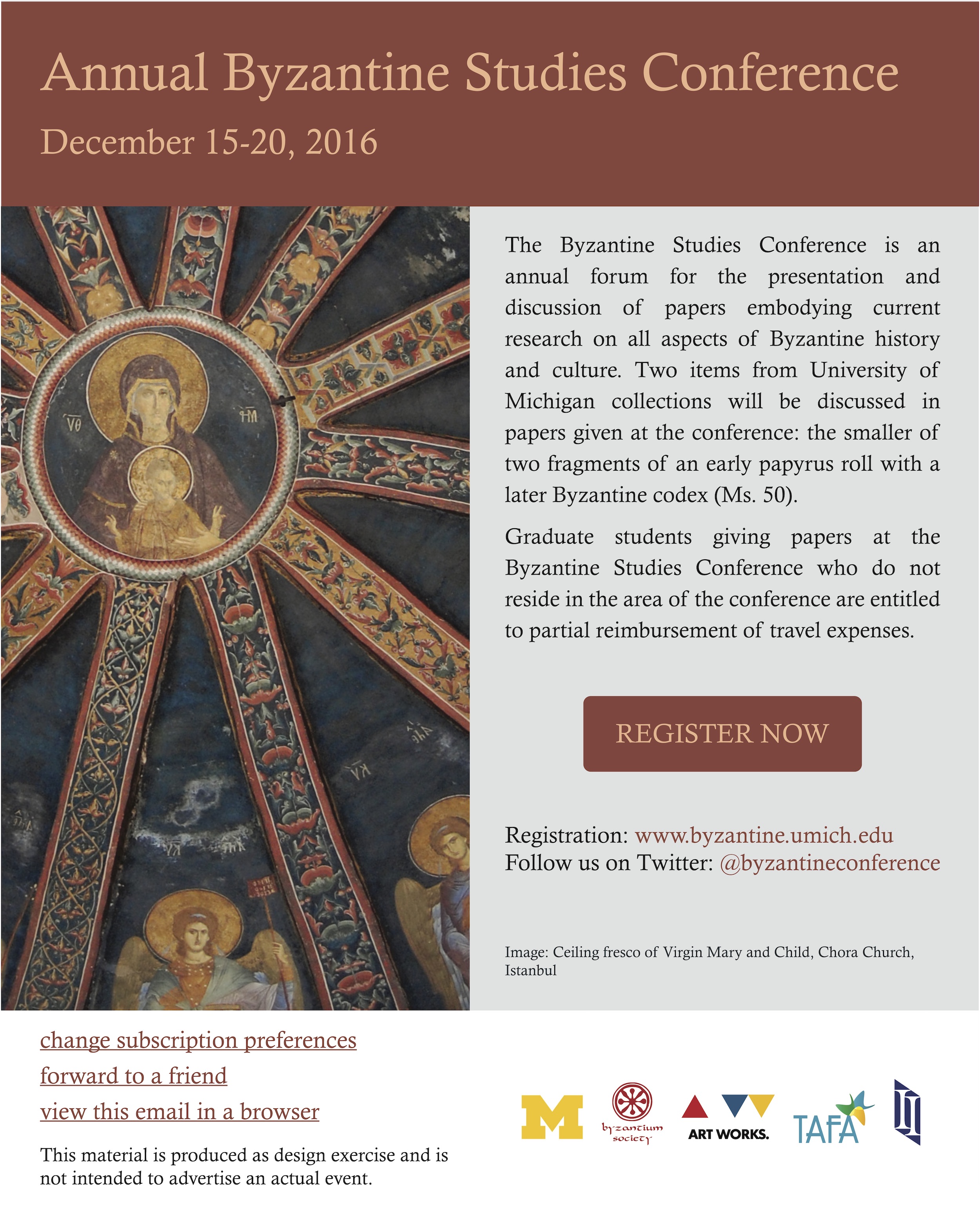
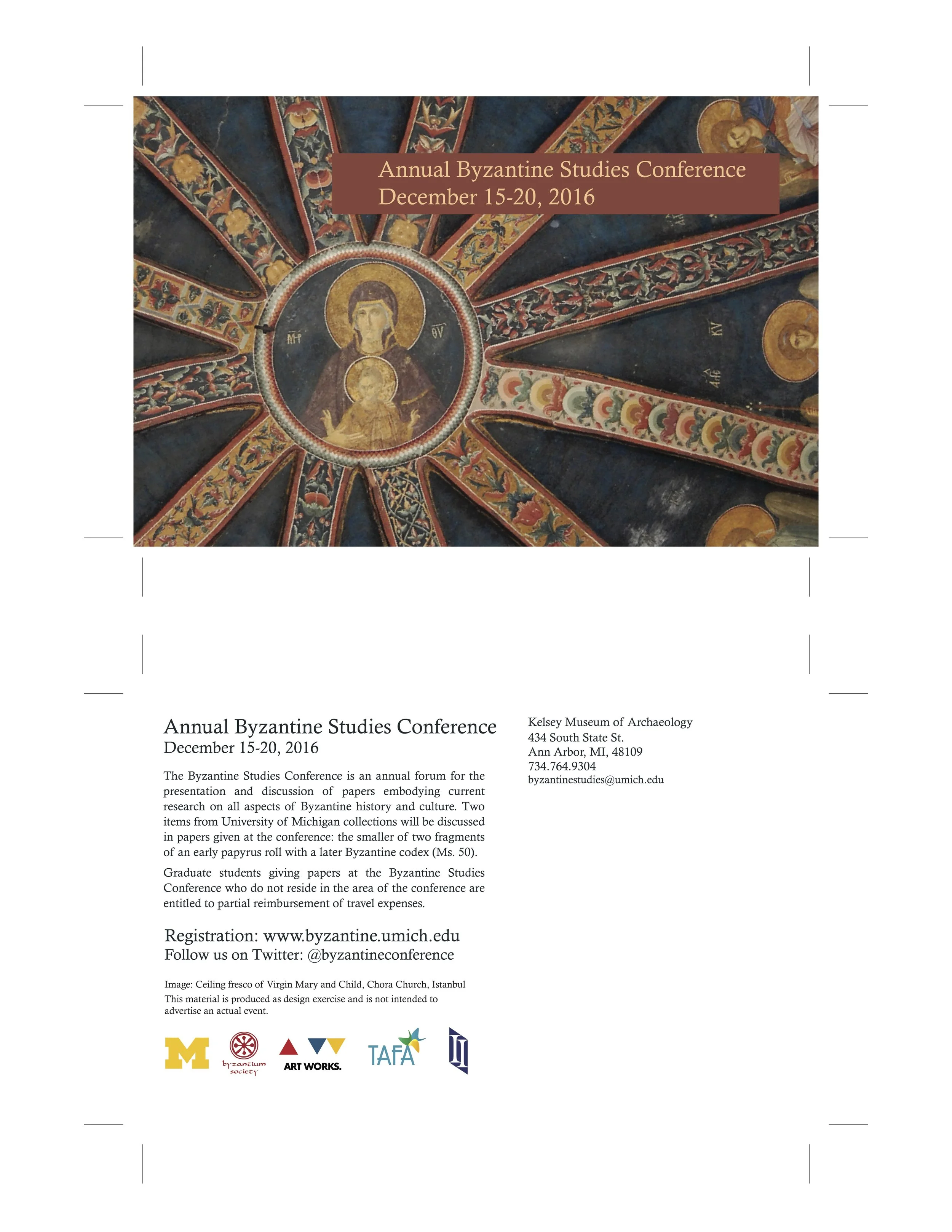
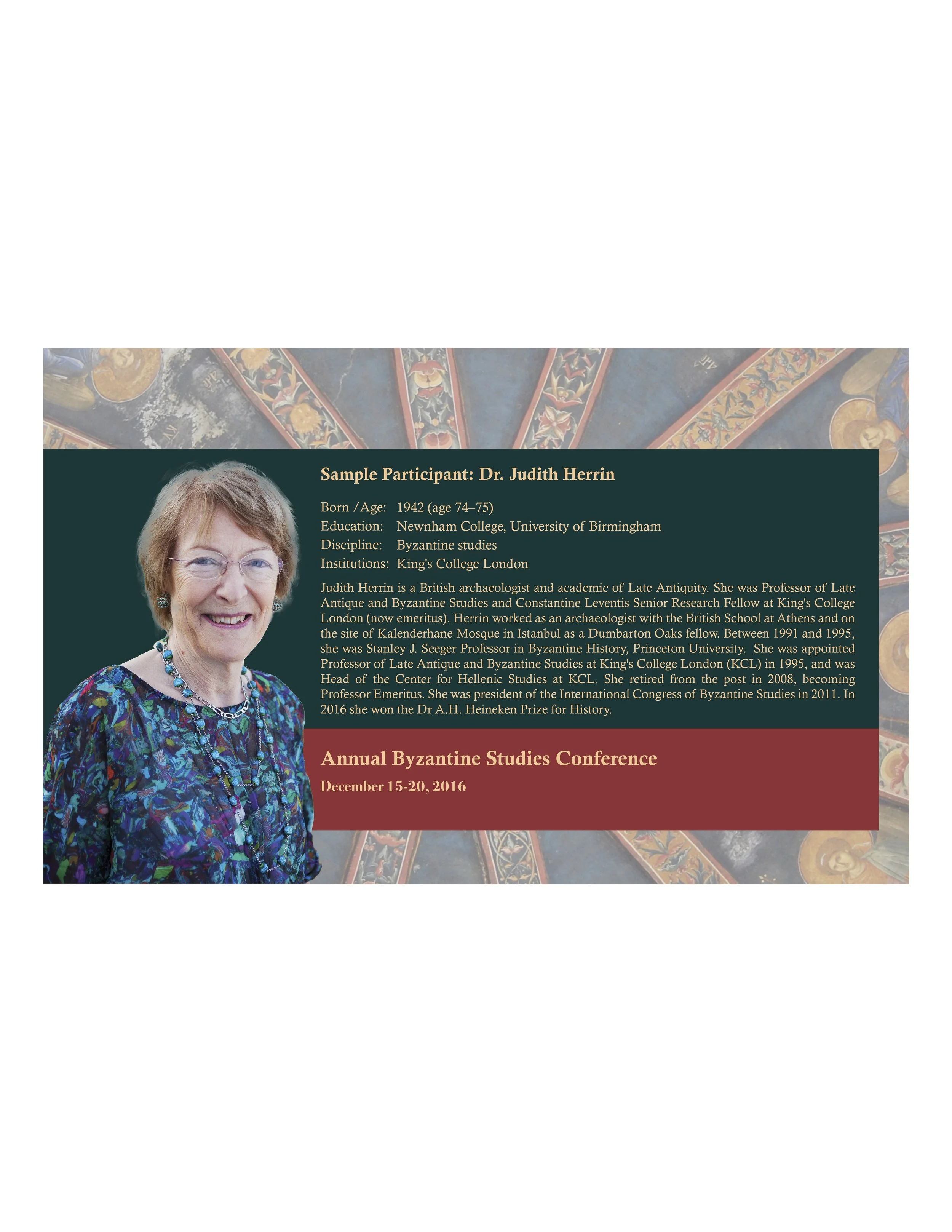
Conference Campaign Materials
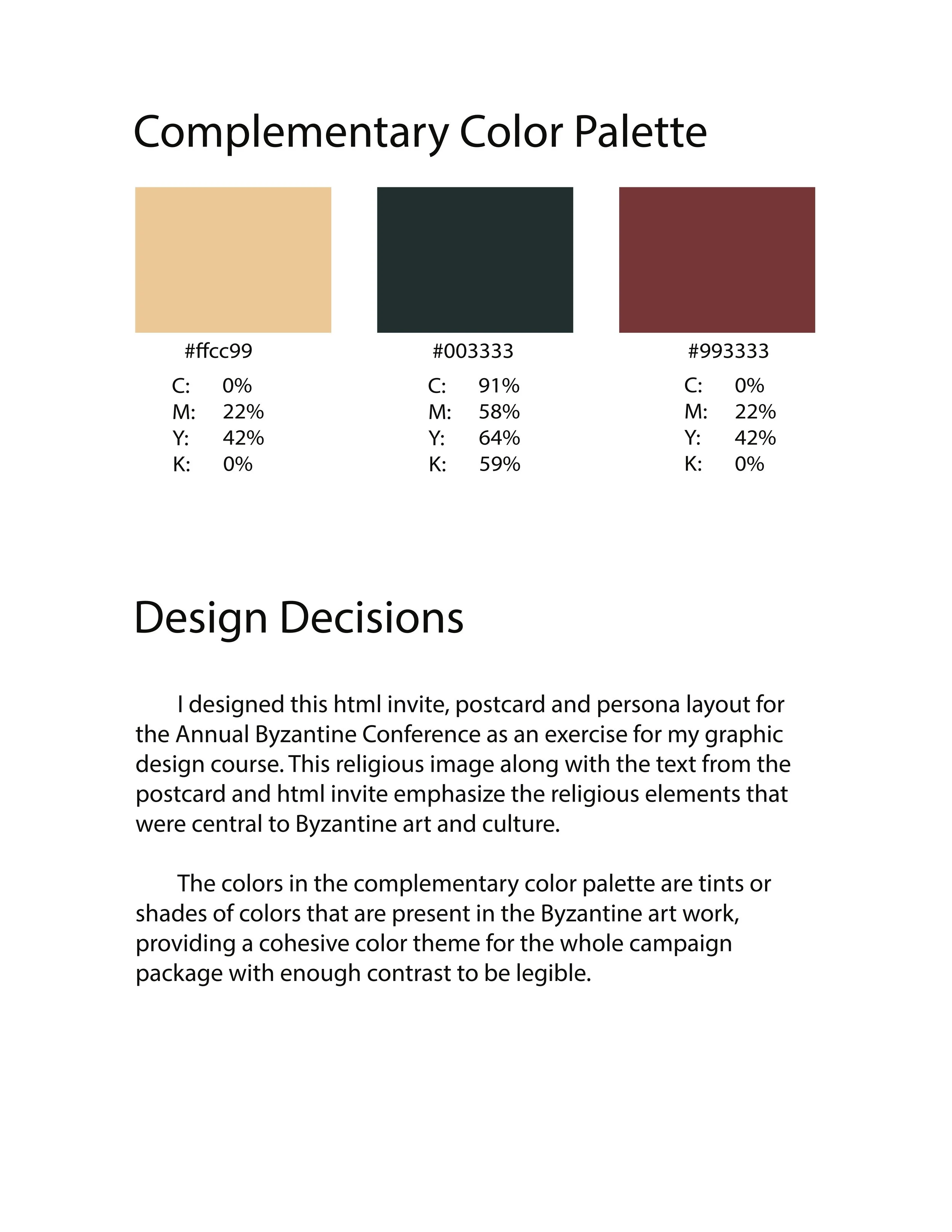
I designed this html email invite, postcard and persona layout for the Annual Byzantine Conference as an exercise for my graphic design course. This religious image along with the text from the postcard and html invite emphasize the religious elements that were central to Byzantine art and culture.
The colors in the complementary color palette are tints or shades of colors that are present in the Byzantine art work, providing a cohesive color theme for the whole campaign package with enough contrast to be legible.
One Subject, Three Visual Identities and Color Themes
I created three different color themes for a website based around my favorite fruit, mango.
The first image is a cool color theme with many different greens.
The second is a warm color theme with many different reds, oranges and maroons.
The third is an accented color theme with yellow as the sharp accent color against blacks and browns.