
Ideas to Wireframes
My research informed the wireframes
We included a calculator in the design to help students calculate how much of their loans they can return each semester.
This was based on Finding 4: All participants wanted a personalized number telling them how much they could reduce their student loans that semester.
We included a subtraction problem that showed students how much of their loans they can return based on the calculator.
This design also comes from Finding 4 where students responded positively to this subtraction problem.
We took out the line graphs and designed more bar graphs to show students’ debt over time.
These designs are based on Finding 3: Students think bar graphs are clearer than line graphs for showing how a loan grows over time. We tried bar graphs with slices showing each part of the loan and double bar graphs showing how much students will save over time.
Wireframes
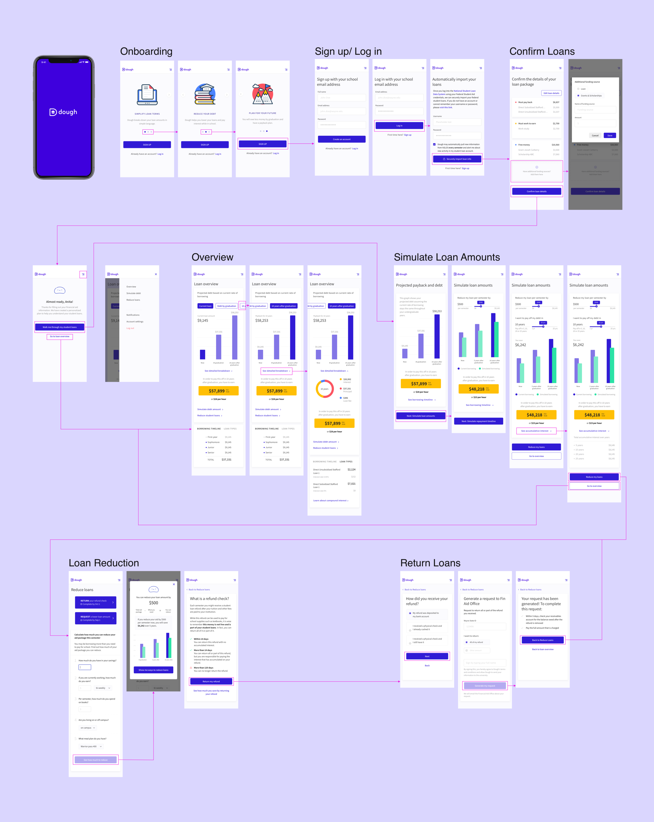
Now that we incorporated the research into our design, we built wireframes to test the full design of our application.
Our initial wireframes had four sections. Onboarding introduces the app to students. The link loan details section connects to Wayne State University’s financial aid office and imports the loans, then students can confirm that all their loans, grants, scholarship and work study aid has imported correctly. After that, students get an overview of their loans and total debt at the moment that they sign on as well as their projected debt at graduation. Finally, they have the option to take action and reduce their loans.
Testing the Wireframes
Methods - Moderated Product Testing & Semi-structured Interviews
After concluding that there was a market for a personalized student loan advisor our next round of testing focused on determining what features were necessary for informing students about their loans and what features were effective at helping them tailor their loan package.
Participants - UMich Undergraduate Students with Debt
This time we recruited undergraduate students with student debt from the University of Michigan. We did this because it was more convenient to test students in Ann Arbor than students in Detroit. Also, my research questions were about higher level concepts and the tests would likely yield similar results in both cities, so there was no need to drive an extra 2 hours to get to Detroit.
I set up station near the University of Michigan and recruited onsite utilizing gift cards as incentives.
Findings - Visual Clarity Needed and a Surprise about Motivation for Loan Reduction
Finding 1: Students’ continued to display an overwhelming demand for a personal student loan assistant product.
“I need this, why doesn’t it exist yet?”
“Is this coming out soon? You know, loans are like, you have to take them out to go to school but nobody ever explains them to you….[asked if they wanted to give us their email address for updates] yeah, I’ll write it.”
Finding 2: Most students don’t know that they can return a portion of their student loan within the first 30 days of the semester. If we are going to encourage students to borrow less money, then we need to tell them that it’s possible to return their loans within the first 30 days and give them instructions on how to do that. Students liked the idea of a calculator function that would help them figure out how much money they could return.
Finding 3: While bar graphs make the total amount of the loans clearer, slicing the bars into pieces, i.e. principle, interest, and loan fee, is confusing. The circle chart on the “Current debt” screen did a much better job conveying the breakdown of students loans. When they saw that circle chart many students were surprised that their loans included loan origination fees. I recommended abandoning the slices and using the circle chart.
“There’s a lot to look at. I prefer something simpler.”
“Ok, what is going on here? Oh, ok interest and principle, loan fee. Why is it red?”
Finding 4: Curved lines on the repayments graph are confusing. People didn’t understand this at all. I recommended taking it out of future designs.

“ No, I don’t know what that means.”
“So it looks like…yeah, I don’t know.”
Finding 5: Hyperbolic discounting (when people put an overly high value on the here and now and an overly low value on the future). A savings of $2,000 in the future wasn’t enough motivation to change student spending habits by $5 a week now. Students were shown the long-term benefits of paying off their loans’ interest early, $5.00 a week towards their loans’ interest could save them $2,000 over the life of their loans. Yet, students said they would rather keep buying a $5.00 cup of coffee each week than pay off the interest of their loans early.
“I’m still going to drink coffee.”
“It’s not going to make a big difference in my loan so I’d rather have the coffee.”
Recommendations
Recommendation 1: Build out the calculator function so students can use it calculate how much money they can return.
Recommendation 2: Alert students that they can return any amount of their loans before the end of the 30 day grace period.
Recommendation 3: Take out the sliced bar graphs in favor of regular bar graphs.
Recommendation 4: Take out the curved line graph.
Recommendation 5: Don’t use the analogy of giving up a cup of coffee each week as the amount students should save each week to pay off loans while in school, look for other analogies. However, this might be a biased finding as our participant sample was recruited at a Starbucks coffee shop.
Dough Interaction Map
This is an on going project. Please email me at lauren.elbaum@gmail.com for information on the latest testing and designs.